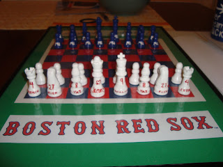
Sorry about the delay, folks. It's been madness trying to get my Etsy store up and running. More on that later... without further delay, I give you the completion of
the story of the chess set.
It was time to make a field for my baseball players. The board that came with the $3 Walmart chess set I was using for the pieces had a few problems. First, the board was the same off white/dark brown color scheme that the pieces came in, which was potentially fixable. Second, the squares were much too large for the chess pieces; they looked like they were from two totally different games. And finally, the board was made out of flimsy cardboard that refused to stay flat. Solution? Make my own board!
I bought some $1 craft foam from Michael's in red and navy blue, and another piece in green to make a little dugout for each team. Knowing that the flatness of the Walmart board was a problem, I also purchased a cheap picture frame so that I could press the foam under glass. I remembered that waaaaay back in elementary school, we had made checkerboard patterns by weaving paper together - it shouldn't be that much harder with craft foam. Right? WRONG.
After two hours of weaving, this was the result:
Pictured: Anger
Chess aficionados will notice that this board-in-progress is missing 2 rows and 2 columns. And it's already too big for the frame. And the more I tried to push the rows and columns in to the center, to make them tighter and reduce the size of the board, the more rows and columns from the outside I lost. It was horrible. The glue-y, foam-y mess that I had created was ruining my life. Worst of all, it was 3 in the morning: I couldn't go to Michael's and start over with new craft foam and smaller strips.
What to do? Luckily I had a few pieces of solid 12x12 scrapbook paper left over that were supposed to be returned home months ago and never quite made it. I'm pretty sure I squealed when I found a red piece and a navy blue piece. I started with narrower rows and columns, and they wove together so much easier than the foam. "Yes," I thought, "this is what kindergarteners do. This is why kindergarteners do not use craft foam."
Board done. Now to put it on the green craft foam so that it looked field-like. But UGH, red and blue checker on green foam? My poor eyes! Not something I wanted to look at. White border, yes please. I quickly cropped together an image I found of the Red Sox and Yankees names, in their respective fonts, and put them on the board to create dugouts. Put it in the frame, and the board is done!
Ta-daaaa!
But this project had a mind of its own, and it kept growing. Next I wanted to write Julia and Dave's full, newly degreed, names on to the box I would present it to them in, in their teams fonts. And koozies were on sale at Michael's, so clearly those were necessary too.
I began the quest for Yankees and Red Sox fonts. Now, if you Google "Red Sox Font", the first thing that comes up is a link to BoSox on Fontspace. Simple, easy, fabulous. I was psyched. The Yankees font? Less simple. After hours upon hours of searching, I was no closer to the script font the Yankees use. My sister suggested that I post on the WeddingBee message boards, since she has had luck there with font searching in the past. Tricksy sister. She reads the message boards religiously. I was too close; there was no way I was risking her finding out about this project now.
It was late. I had to leave for Atlanta fairly soon. I decided that juxtaposed with the Red Sox font, any simple script in navy blue would look like a Yankees font. Snell Roundhand it is. I slapped it on the card for Dave, and added some scraps left over from the paper I used for the checkerboard.
All tucked away in its box and ready for the trip
Julia's Koozie
Dave's Koozie
The most expensive part of this project was the plastic storage containers I used to keep the pieces safe on their journey to Atlanta. I used little art storage bins from Joann's, and stuffed each square with a folded tissue and a tiny square of wax paper to cushion and protect the piece. I had an extra logo for each team from printing out the dugout names, so I glued that on each box top. Unfortunately, the pictures of those came out kind of dark and awkward, so you'll just have to imagine them!
Finally finally finally, everything was packed up and ready to be revealed. I carried the giant cake box stuffed with the piece boxes, then the board, then the cards, and the top with their beautiful titled names. The koozies had to be carried separately. After Julia's research presentation, I kicked them out of their own dining room to set up the set. It's far more impressive set up than in box form!
And of course the best part: their reactions.
I'm not going to lie. I've never been prouder of a project. I just hope it holds up, and that they get a lot of love and use out of it. Congratulations again, guys!


